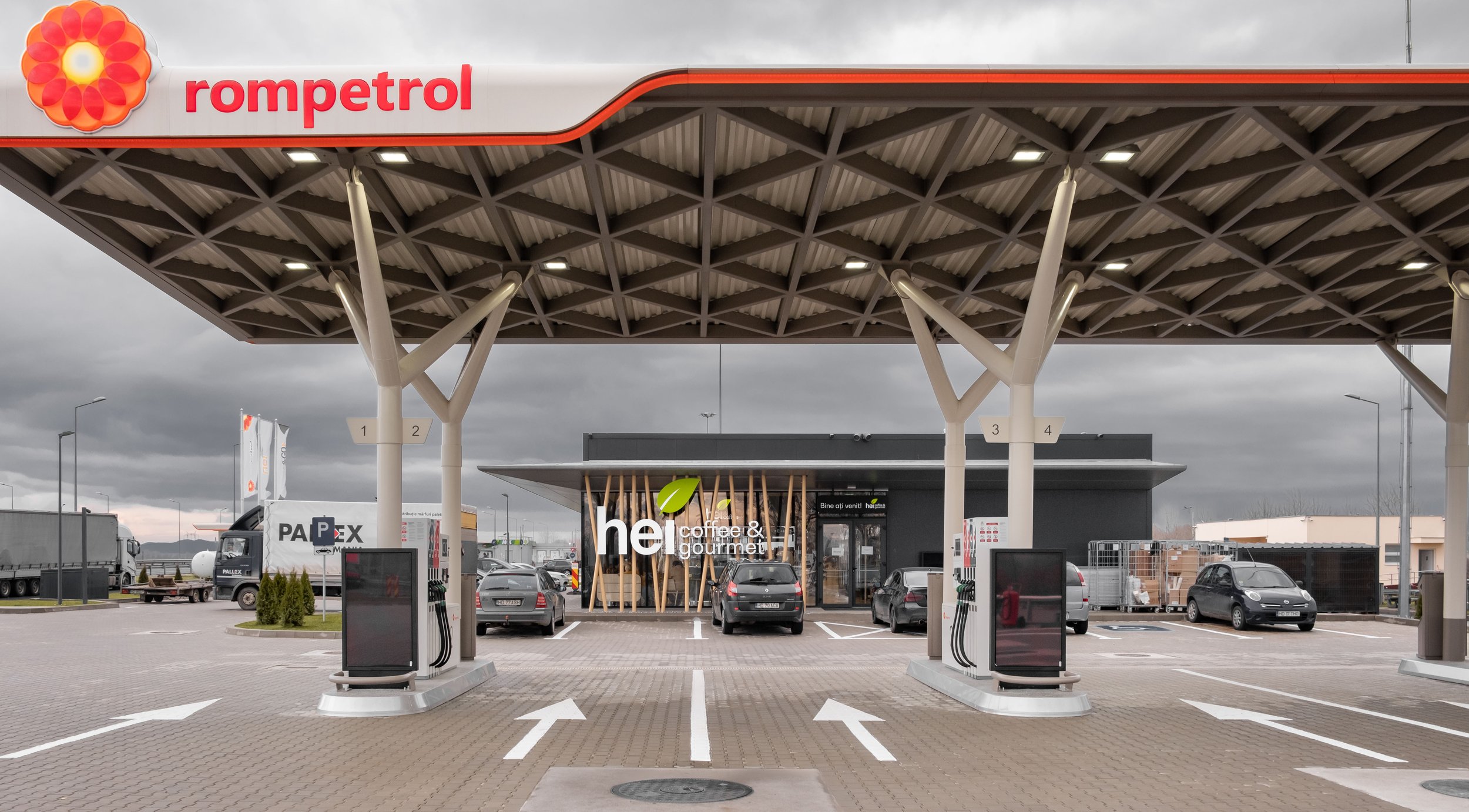
The groundbreaking concept introduced in the HEI and Rompetrol stations marks a significant leap forward in the realm of retail and gas station design. This innovative approach is truly disruptive in both operational strategies and design aesthetics, setting an unprecedented standard in the local market.
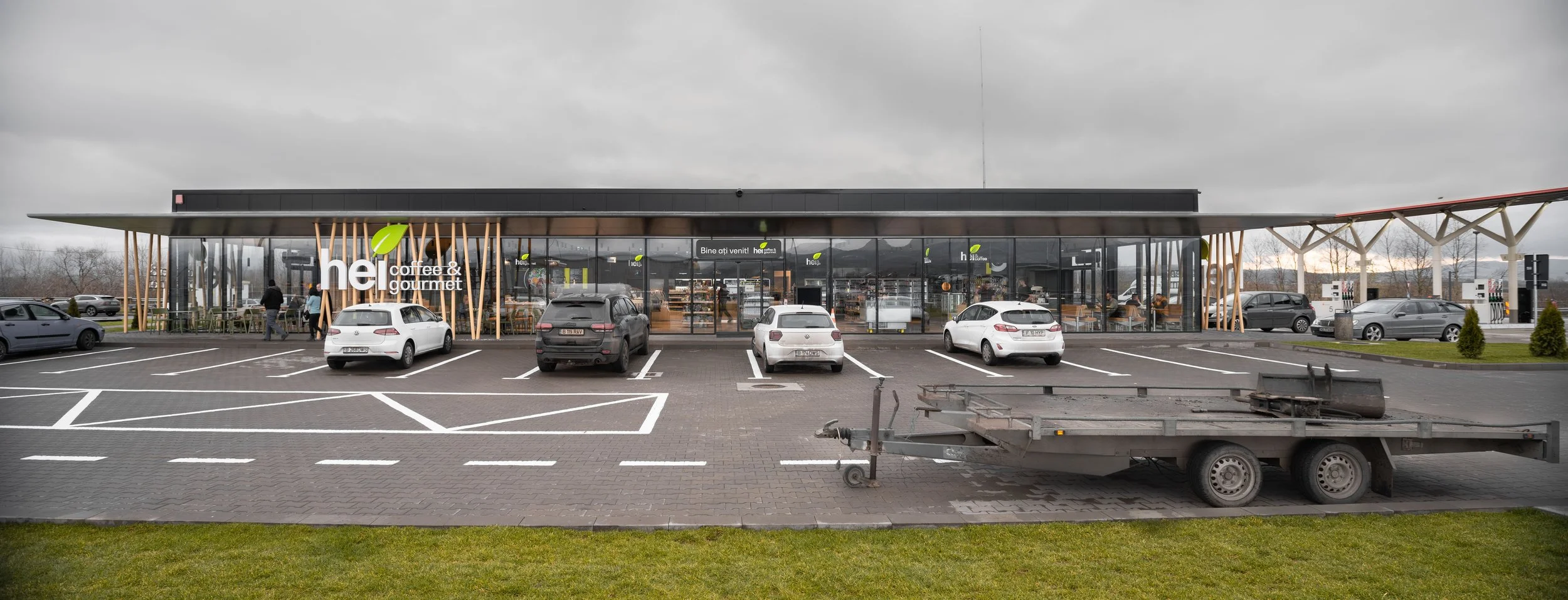
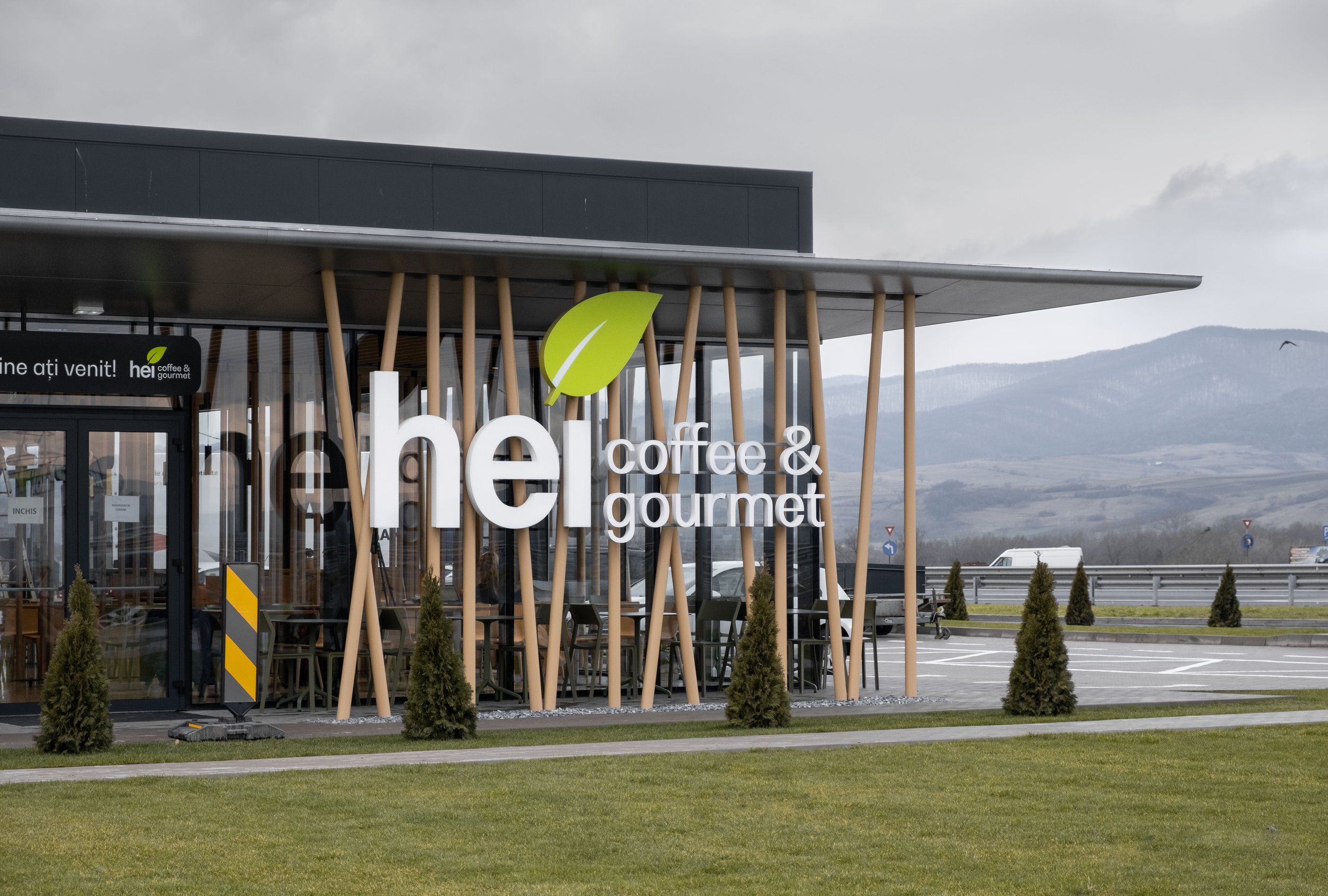
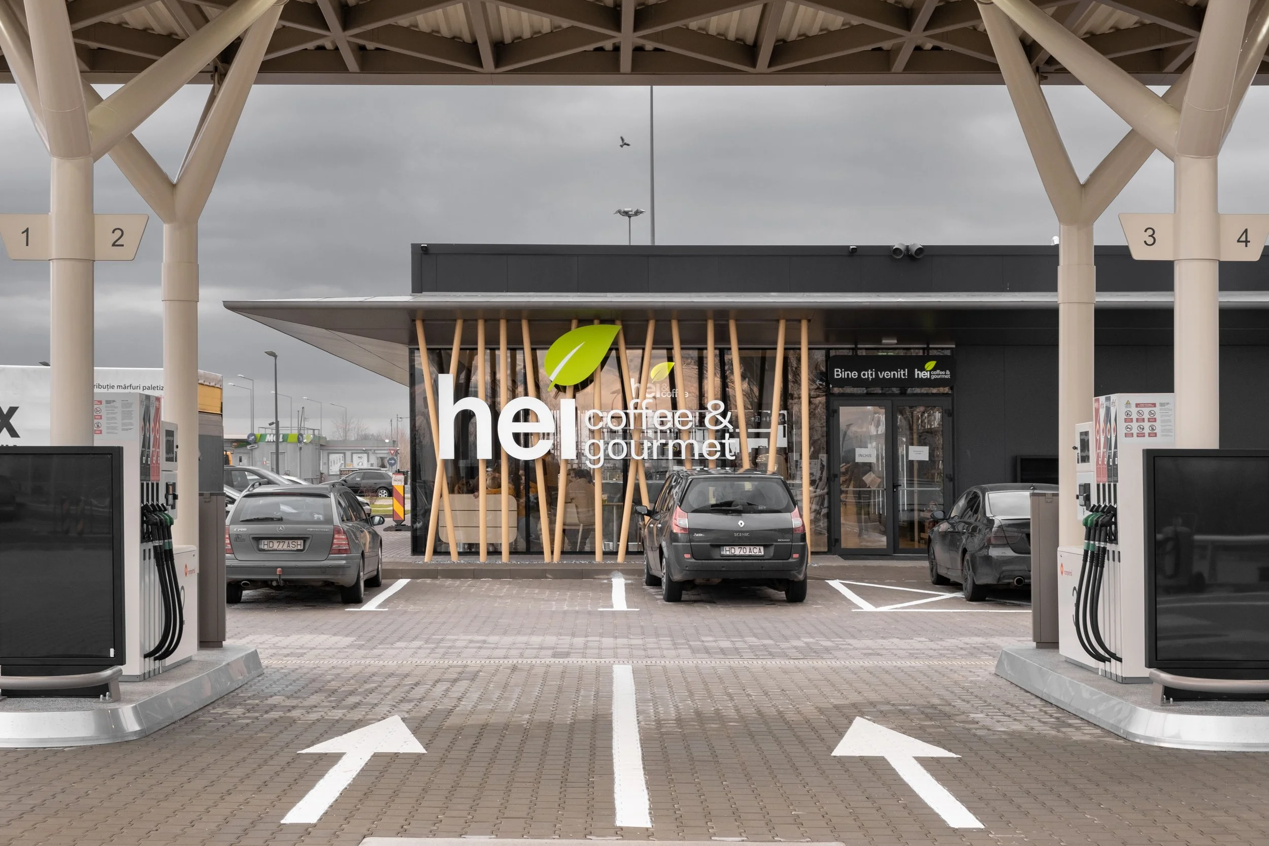
Diverging from the conventional gas station typology seen along highways, the exterior and interior designs of these stations draw inspiration from the sleek, efficient layouts commonly found in airports. This departure transforms the stations into more than just refueling points, elevating them into immersive spaces that redefine the overall customer experience.
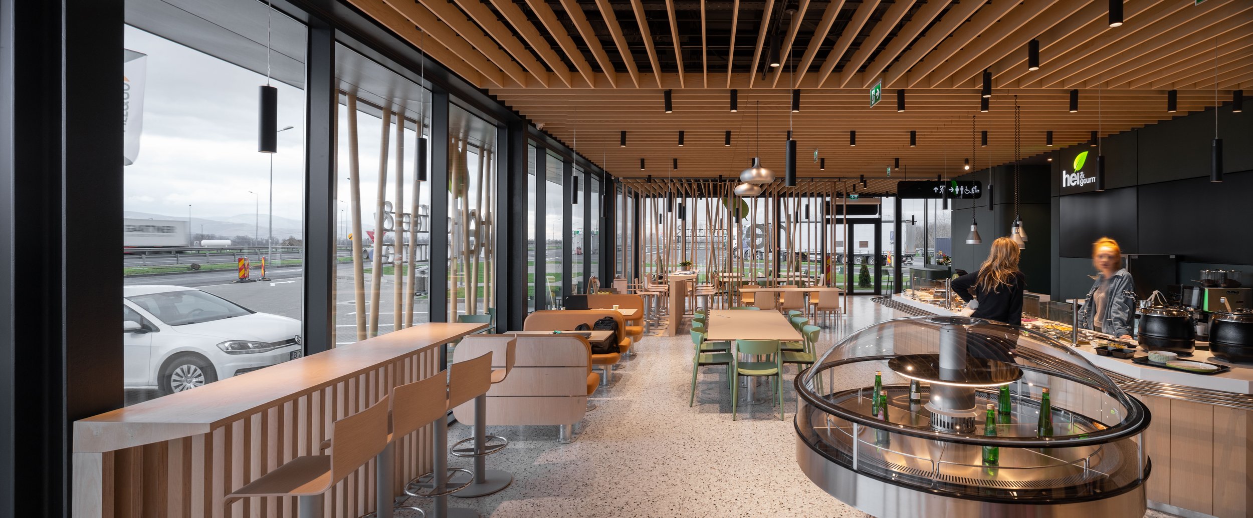
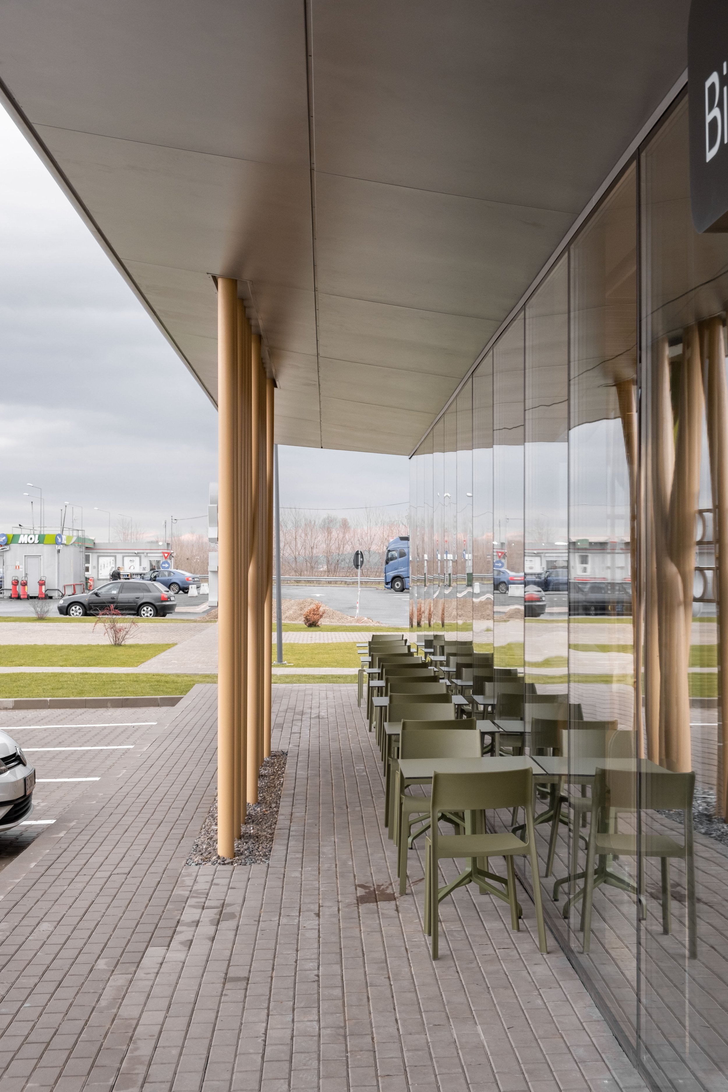
The exterior showcases a distinctive feature—an almost 3-meter cantilevered metal wing. This not only acts as protection for customers but also serves as a shield for the floor-to-ceiling shop windows. This thoughtful design element not only enhances safety but also contributes to the overall aesthetic appeal.
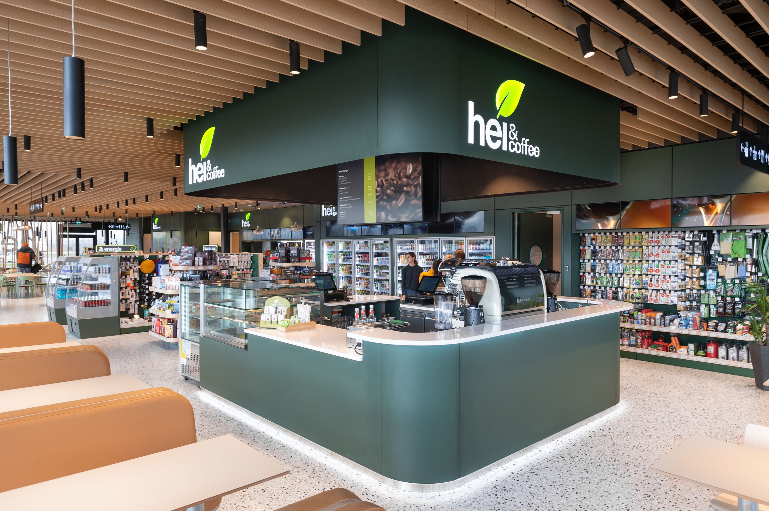
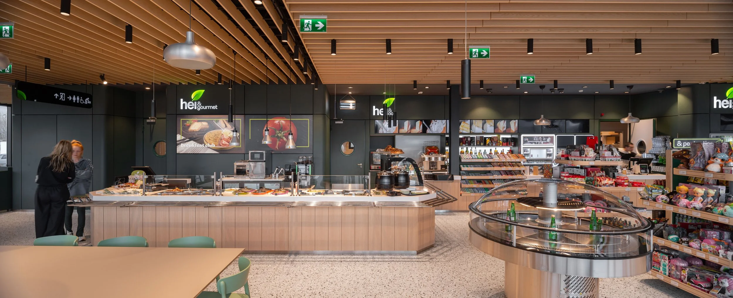
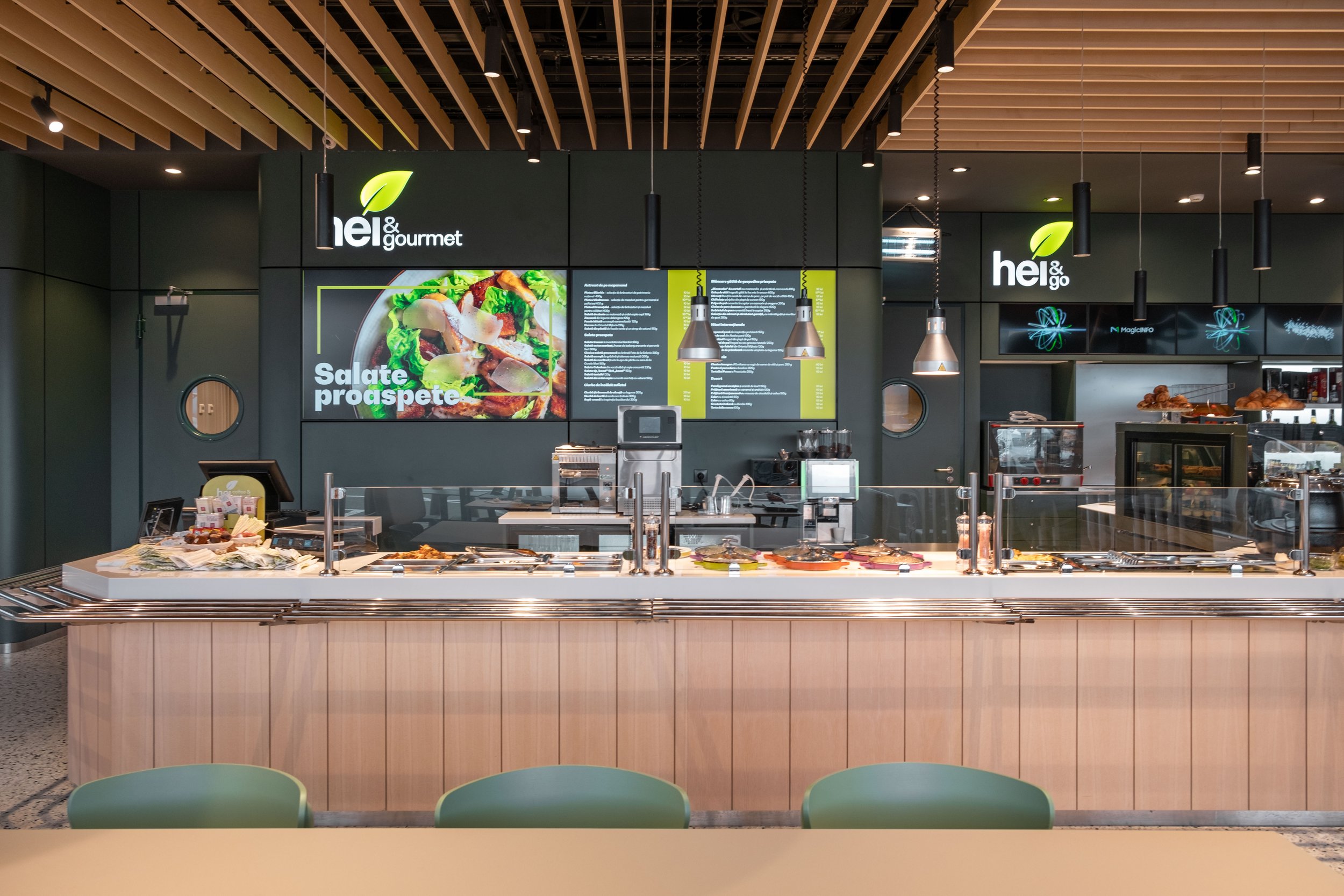
Stepping inside, the interior boasts a rich palette of natural materials and textures. From a natural veneer ceiling to terrazzo made of natural stones, and the inclusion of massive wood elements, the design evokes a connection with nature. Subdued tones of green permeate the space, creating a calming and inviting ambiance. The interior is divided into three main sections: the market, the coffee shop, and the restaurant, catering to diverse customer needs.
Furniture within the space features rounded corners, seamlessly aligning with the sinuous flow of customers. This design choice not only enhances comfort but also facilitates smooth circulation within the space. The restrained color palette exudes naturalness and refinement, contributing to a sophisticated and timeless contemporary look.
Dedicated lighting, strategically placed, ensures an intimate atmosphere, with highlights precisely where needed. This approach, akin to the ambiance of a restaurant, distinguishes the interior from traditional gas station environments. Streamlined furniture lines encourage fluid circulation, guiding customers effortlessly between the main points of interest.
This project is a collaborative effort with Corvin Cristian Studio
Team: Corvin Cristian, Serban Rosca, Ana Malaianu, Petru Lalut, Vlad Hani
